
Beyond Aesthetics with Functional Elements of Wine Labels
Picking the right bottle of wine can often feel like a bit of a gamble, right? Trust us, we’ve found ourselves scratching our heads in the aisles, trying to make sense of all those labels.
What’s ace is that here in Australia, wines have to wear their hearts on their sleeves – well, not literally! But they do have to display crucial info on their labels which makes choosing a good drop so much easier.
Our blog is about to take a deep dive into how these little details on wine bottles are more than just pretty decoration; they’re your best mates when it comes to making savvy choices without breaking a sweat.
Key Takeaways
- Wine labels must display vital info like the supplier’s name and street address, country of origin, alcohol by volume, standard drinks, net volume, any allergens, lot identification and the pregnancy warning label. This helps consumers know exactly what they’re buying.
- Labels can also show quality and origin details such as “Reserve,” “Single Vineyard,” or specific regions like “Barossa Valley.” These are optional claims, and once made they need records behind them, which is what assures customers about the wine’s authenticity and quality.
- Design elements on wine labels, including eye-catching illustrations and unique textures, not only attract attention but tell a story about the wine and its heritage.
- Innovative features on labels like QR codes or sustainable materials cater to modern consumer preferences while enhancing engagement with the brand.
- Traditional bottle shapes and colours hold significant meaning in conveying a wine’s identity; keeping an eye on current trends while respecting tradition is key to standing out in the market.
Understanding Australian Wine Labels
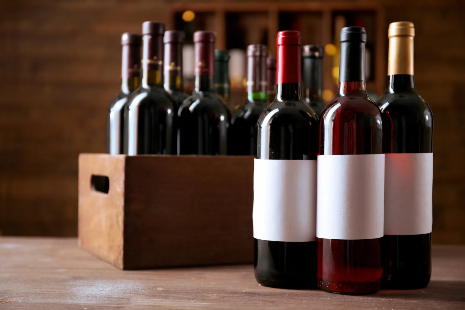
Australian wine labels require mandatory information and may include additional labels denoting quality and origin. Understanding the various elements of Australian wine labels is crucial for navigating the market and making informed purchasing decisions.
Mandatory information required
We all understand the importance of meeting legal requirements on our wine labels. They’re not just about graphic design or creating consumer appeal; they’re also about providing essential information.
Every bottle must display the name or description of the product, the supplier’s business name and street address, country of origin, alcohol by volume, the number of standard drinks, the net volume, and allergens such as sulphites. This basic info ensures our customers know exactly what they’re getting, which boosts trust and brand integrity.
Additionally, we have to include lot identification and, since 31 July 2023, the pregnancy warning label on any beverage over 1.15% alcohol by volume. That warning is a prescribed mark rather than a free design choice: the pictogram, the words “PREGNANCY WARNING” in red bold sans-serif capitals, and “Alcohol can cause lifelong harm to your baby” in black sentence case. These elements might seem small but they shape the layout of the whole label, so they are worth planning for from the first sketch.
It’s about going beyond aesthetics to meet mandatory guidelines that safeguard both us and our consumers. Now, let’s take a look at additional labels for quality and origin that can further distinguish our wines.
Additional labels for quality and origin
Quality and origin labels on wine bottles are vital for communicating important information to consumers. These additional labels can indicate a particular region, vineyard, or grape variety used in the production of the wine.
They assure authenticity, quality, and specific characteristics that differentiate a wine from others. The label might denote special attributes like “Reserve,” “Single Vineyard,” or geographical indications such as “Coonawarra” or “Hunter Valley.” None of these are compulsory, but each one you claim needs records that can back it up, and that is exactly what builds trust with customers and enhances the perceived value of your product.
Beyond being informative, these labels contribute to branding by highlighting unique selling points and creating a sense of exclusivity around your wines. When prioritising label design elements, it’s essential to consider how these additional labels for quality and origin play into the overall packaging strategy – they’re not just regulatory requirements but marketing tools that can set your products apart in a competitive market.
Revealing Top Australian Wine Labels
Discover the most captivating label designs that have put Australian wines on the map. Explore the innovative and creative features that make these labels stand out among the competition.
Best label designs
When creating label designs, we focus on eye-catching illustrations and bold typography. We aim to convey the essence of our wine through distinct and memorable visual elements. Our designs emphasise the brand identity, grape varietal, and story behind each bottle.
To captivate consumers, we incorporate unique touches like embossing, foil stamping or textured materials for a tactile experience. These design choices set our bottles apart on shelves as premium offerings. Ultimately, our labels serve as a powerful marketing tool that enhances our customers’ perception of our wine range.
Innovative and creative features
After focusing on the best label designs, it’s essential to consider innovative and creative features that can make your wine labels stand out. Incorporating unique textures, embossing, or matte finishes can elevate the overall look and feel of your labels, capturing the attention of potential consumers.
Adding interactive elements such as QR codes or augmented reality experiences creates an engaging and memorable interaction with your brand, setting you apart from competitors.
Integrating sustainable materials or eco-friendly ink options not only showcases social responsibility but also appeals to environmentally conscious consumers. Furthermore, incorporating storytelling elements into your label design can create a deeper connection with customers by sharing the history, culture, or inspiration behind each wine.
Importance of Wine Packaging
Wine packaging plays a crucial role in attracting consumers and setting the tone for the product. It also reflects the brand identity, creating a lasting impression on potential buyers.
Attracting consumers
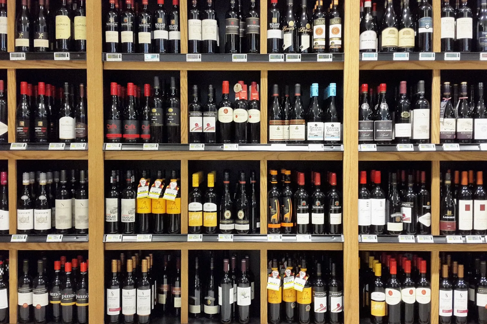
To attract consumers, consider creating wine labels that stand out on the shelves. Vibrant colours and eye-catching designs can pique the interest of potential buyers browsing through an array of options.
Highlighting key information such as the grape variety, region, and tasting notes in a clear and easy-to-read font can help consumers make informed choices when selecting a bottle.
Incorporating unique features like foil stamping or embossing can also evoke a sense of luxury and sophistication, capturing the attention of discerning customers.
When designing wine labels, it’s important to keep in mind the target audience and their preferences. Understanding consumer demographics can guide decisions on label aesthetics and messaging to ensure they resonate with your desired market segment.
Setting the tone
To set the tone, wine labels play a crucial role in reflecting the brand’s identity and values. Incorporating elements like font styles, colours, and imagery can convey a sense of sophistication, fun, or tradition. It’s essential to align these visual aspects with the intended target audience to ensure that the label resonates with potential consumers.
Furthermore, thoughtful design choices can significantly impact consumer perception and influence purchasing decisions. Utilising unique features and innovative techniques on wine labels can help create a lasting impression on customers while showcasing the product’s quality and distinctiveness.
Reflecting brand identity
When designing wine labels, we focus on reflecting the unique personality and values of our brand. Our label design captures the essence of our winery, communicating the story behind our product and connecting with our target audience.
We ensure that every element from colour palette to typography aligns with our brand identity, creating a cohesive visual representation that distinguishes us in the market.
To set ourselves apart and establish a strong brand presence, we prioritise consistency across all marketing materials. This includes maintaining uniformity in label design, and ensuring that consumers easily recognise and associate our wines with our brand.
Wine Bottle Aesthetics: Shapes, Colours & Sizes Explained
Explore the significance behind the five principal wine bottle shapes, as well as the evolving trends and traditions in bottle shapes. Learn about the importance of traditional colours and how labels impact marketing and wine integrity.
The 5 principle wine bottle shapes
Wine bottle shapes play a crucial role in conveying the identity of your wine. Each shape has its unique influence on consumer perceptions and preferences. Here are the five primary wine bottle shapes to consider when packaging your product:
- Bordeaux Bottle: This classic shape features straight sides and high shoulders, perfect for red wines like Cabernet Sauvignon and Merlot.
- Burgundy Bottle: With sloping shoulders and a wider body, this bottle suits full-bodied white wines like Chardonnay, as well as Pinot Noir.
- Hock Bottle: Characterised by its tall, slender design with gentle slopes, this bottle is ideal for Riesling and other aromatic white wines.
- Champagne Bottle: The wide base and pronounced punt make it suitable for sparkling wines, providing space for the carbonation to develop while adding an elegant touch.
- Rhône Bottle: This stout, rounded shape accommodates robust red wines such as Syrah and Grenache, showcasing their depth and intensity.
Trends and traditions in bottle shapes
The wine industry is seeing a resurgence of traditional bottle shapes, such as the Bordeaux and Burgundy styles. Consumers are drawn to these classic shapes, which exude a sense of heritage and authenticity.
However, there’s also a growing trend towards more modern and sleek bottle designs that appeal to younger demographics. Wine companies need to consider how their choice of bottle shape can reflect the brand identity while also appealing to evolving consumer preferences.
In addition to shape, the size and weight of wine bottles are becoming important considerations in sustainable packaging practices. Smaller, lighter bottles are gaining popularity due to environmental concerns and cost-effective shipping.
Importance of traditional colours
Traditional colours on wine labels play a crucial role in conveying the essence and heritage of your brand. Utilising classic hues such as deep maroons, rich greens, or royal blues evokes a sense of time-honoured tradition while also catching the eye of consumers.
These colours are steeped in history and are instantly recognisable to enthusiasts, establishing a connection between your product and established winemaking practices. By incorporating these traditional colours into your label design, you can effectively communicate authenticity and quality to potential customers.
Furthermore, traditional colours serve as an effective tool for differentiating your wine from competitors on store shelves. They help consumers identify specific varietals or types at a glance, aiding purchase decisions by providing visual cues that align with their preconceived notions about certain wines.
The impact of labels on marketing and wine integrity
Wine labels are crucial for marketing and maintaining the integrity of your product. Eye-catching designs, informative content, and a clear reflection of brand identity can attract consumers and set the tone for their experience with your wine.
Utilising label space strategically to highlight key information about quality, origin, and unique selling points can effectively communicate the value of your product.
Incorporating innovative features like QR codes for additional information or interactive elements on labels can enhance consumer engagement and create a memorable impression. Additionally, ensuring that mandatory information is presented helps build trust with consumers while meeting legal requirements.
Consistent branding across packaging reinforces your brand identity in the minds of consumers, establishing recognition and loyalty.
Understanding the impact of wine labels on marketing and integrity allows wine businesses to leverage this essential element to captivate consumers’ attention while communicating vital details about their products effectively.
Achieve Aesthetic Wine Labels
In summary, wine labels are more than just pretty designs. They serve a crucial function in providing essential information to consumers. Understanding the functional elements of wine labels is vital for wine business owners to attract and retain customers.
The informative and innovative features on wine labels can set your product apart from the competition, making it an important aspect of branding and marketing strategies. Reflecting brand identity through label design can ultimately influence consumer perceptions and purchasing decisions. Get in touch with us today for a wine label beyond aesthetics.
Contact
Talk to us about your label
Tell us about the wine, the run size and any deadline you are working to.