
Wines
Labels by Style of Wine
A label is not one problem, it is several. What suits a sparkling bottle will not suit a heavy Shiraz, and a white that lives in an ice bucket asks something different again. Here is how the design decisions shift across three familiar styles.
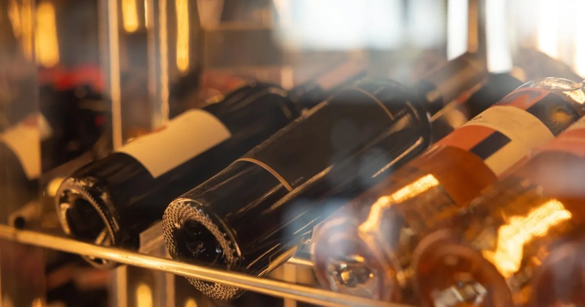
Sparkling
Sparkling and Brut
Sparkling bottles have a pronounced shoulder and a deeper punt, so labels sit on a tighter curve and a wide rectangle will crease. Narrower formats and die-cut shapes handle it better.
Foil and metallic film do a lot of work here, since celebration is the association and reflectivity reads as festive under low light. The practical catch is condensation: these bottles spend their life in ice, so the stock and adhesive have to tolerate a wet surface without lifting or bleeding.
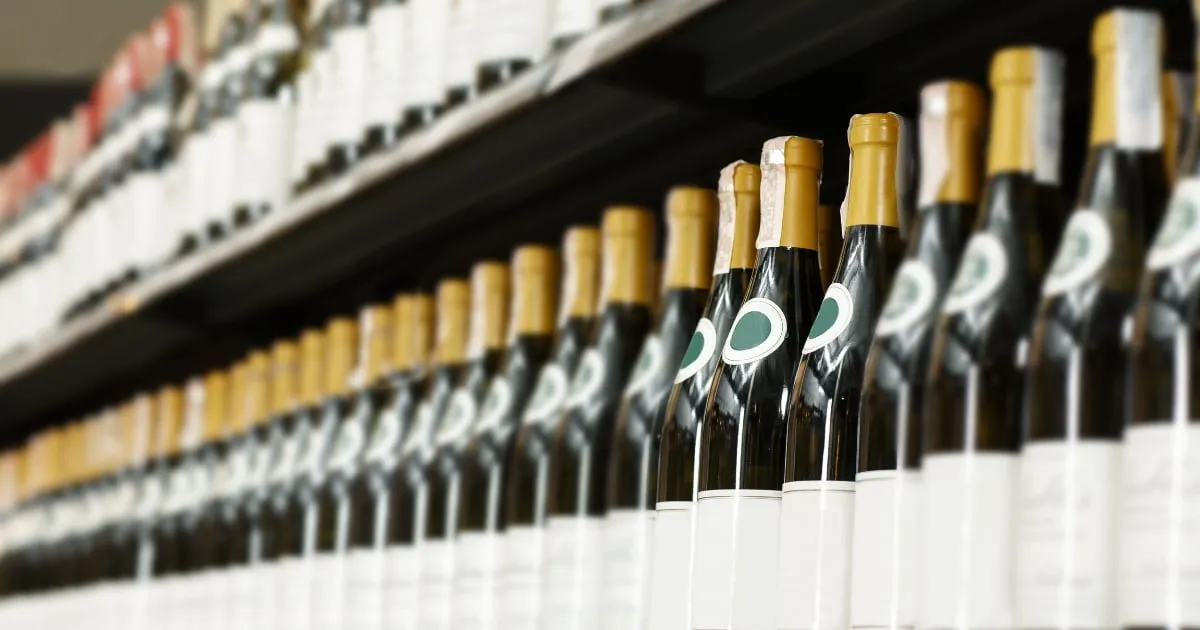
White
Chardonnay and whites
Whites are usually shown chilled and often in clear or pale green glass, so the label is seen against the wine itself rather than against dark glass. Pale stocks and generous white space suit that, and translucent films can make a label look as though it is printed on the bottle.
Because the bottle sweats, water resistance matters as much as it does for sparkling. Uncoated papers look beautiful dry and can pulp in a chiller, which is worth knowing before the run is printed rather than after.
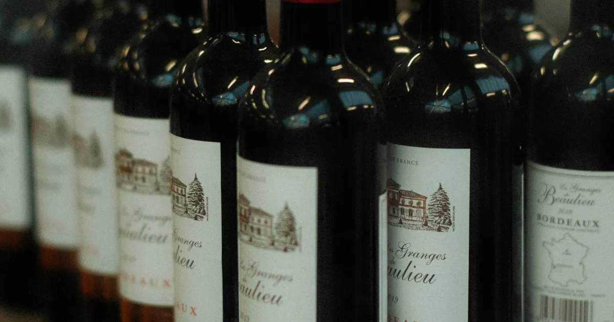
Red
Shiraz and reds
Reds sit in dark glass at room temperature, which changes the contrast problem entirely: the label is the only light thing on the bottle, so it carries all of the visual weight.
This is where heavier textured stocks, embossing and letterpress earn their keep, since the hand feel is part of the impression. Reds also tend to be cellared, so the label has to survive years of storage and any humidity that comes with it.
Contact Us
Transforming Wine Bottles into Works of Art
Contact us today to start your journey towards creating a prestigious wine label that truly reflects your brand's essence and captivates wine enthusiasts worldwide. Cheers to excellence in wine labelling with Prestige Wine Labels.