
How to Design Wine Labels for Different Bottle Types (Bordeaux, Burgundy, Champagne)
Design wine labels based on the bottle shape and proportions. Bordeaux bottles need rectangular, structured labels that align with their tall, straight sides. Burgundy bottles require shorter, curved labels that fit their wider body and sloping shoulders. Champagne bottles work best with compact labels that suit their thicker glass and smaller surface area.
Each bottle type demands accurate sizing and placement so the label applies neatly and maintains a balanced appearance. Matching the label design to the bottle shape ensures consistency, precision, and a professional presentation.
Bordeaux Bottles – Clean and Structured
Bordeaux bottles have straight sides, tall profiles and high shoulders. These features make them suitable for rectangular labels with clear edges and balanced alignment. Each label should maintain symmetry and proportion to match the bottle’s height and structure.
A label height between 90 and 100 millimetres fits most Bordeaux bottles while keeping the design balanced. The width should remain narrow enough to avoid wrapping too far around the glass, which can distort the layout. A centred logo and varietal name fit neatly within the upper area, leaving space below for vintage or producer details.
Fonts with clean lines and consistent spacing match the bottle’s formal shape. Serif fonts suit classic wines, while sans-serif options create a more modern appearance. Colour choices should reflect the wine’s style and maintain consistency across the range.
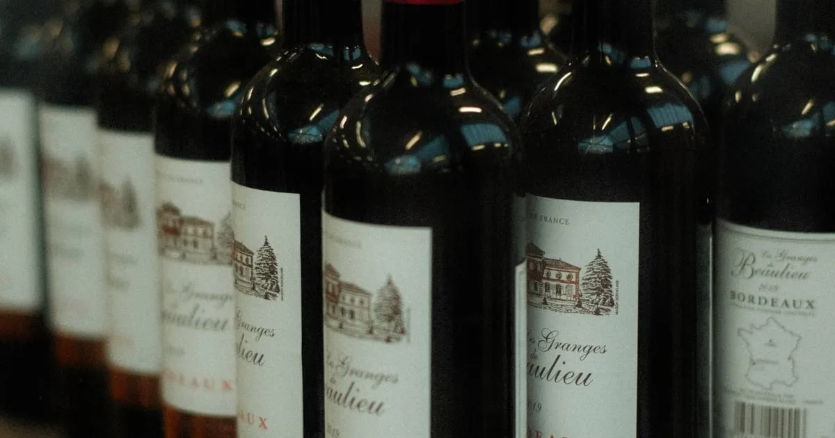
Burgundy Bottles – Elegant and Rounded
Burgundy bottles have a wide body and sloping shoulders. Their curved surface makes label placement more difficult than on straight-sided bottles. A label that is too tall or stiff may crease or lift at the edges, so the size and paper type must match the bottle’s shape accurately.
A height between 100 and 110 millimetres and a width around 80 millimetres fit most Burgundy bottles. A shorter label with curved edges applies more smoothly to the glass. Centred text and well-spaced elements sit evenly across the wider body, keeping the design balanced and easy to read.
Soft colour palettes, cream or neutral backgrounds and refined typography align with the traditional appearance of Burgundy wines. Simple layouts and subtle borders maintain clarity while complementing the bottle’s rounded form.
Champagne Bottles – Bold and Luxurious
Champagne bottles are heavier and thicker than other types and are built to handle pressure. Their broad body and deep punt reduce the flat surface available for the label, which makes precise sizing essential.
Labels for Champagne bottles work best when they are short and wide. A height between 80 and 90 millimetres allows the label to sit below the curve without wrinkling or lifting. Many producers also add a smaller neck label or foil element to provide extra space for branding and product details.
Simple, structured layouts with clean fonts keep the design clear on the smaller surface. Textured paper, metallic finishes and consistent alignment across the main and neck labels create a premium appearance without clutter. Each label should enhance the bottle’s strong design rather than compete with it.
Test Before You Print
Label performance depends on how it fits and adheres to the bottle. Small changes in size, curve or paper thickness can affect the final appearance once applied. Testing each design on an actual bottle helps confirm that the label fits properly and maintains a smooth surface.
A test print allows adjustments to be made before production. This step identifies issues such as creasing, edge lifting or misalignment. It also confirms that colour, finish and print density appear consistent under normal lighting conditions.
Designers and printers should work together to refine the label position and application method. A difference of only a few millimetres can affect alignment and the overall presentation. Careful testing ensures a precise fit and a professional result across all bottle types.
Professional Examples and Design Insights
Examining real label designs helps refine layout choices and understand how each shape affects presentation. Wine Design has been creating personalised wine bottles for Australians since 2009.
Reviewing real examples provides a reference for label dimensions, font placement and material options. It also shows how different colours, textures and finishes influence the final appearance. Observing a variety of successful designs can help guide consistent branding across a full wine range.
Australian wineries often adapt traditional layouts to suit local preferences, combining clear typography with practical label sizes. Analysing these designs can help identify what works well for different bottle shapes and printing techniques.
Accurate Label Design for Every Bottle Type
A wine label should match the bottle’s shape and proportions. Correct sizing and placement ensure the label fits neatly and presents the wine clearly. Bordeaux bottles suit rectangular layouts, Burgundy bottles need shorter curved designs, and Champagne bottles work best with compact formats that sit cleanly on the glass.
Each label must align with the bottle’s dimensions to achieve a consistent, professional appearance across a full range.
Contact Prestige Wine Labels for wine label design and printing solutions suited to every bottle type.
Frequently Asked Questions
Why does each bottle type need a different label design?
Each bottle shape has distinct curves and dimensions, so label height and width must change to achieve a smooth, accurate fit.
How can I measure the correct label size for a bottle?
Measure the flat surface between the shoulders and base, then test the label on the bottle to confirm that it aligns without creasing.
What happens if a label is too tall for a curved bottle?
It may wrinkle or lift at the edges, which affects both appearance and adhesion. Adjusting label height prevents this issue.
Can one layout work across multiple bottle types?
Not exactly. The design style can stay consistent, but the label shape and dimensions need adjustment for each bottle type.
How important is alignment when applying wine labels?
Accurate alignment keeps text straight and centred, helping the label look professional and balanced on the bottle.
Contact
Talk to us about your label
Tell us about the wine, the run size and any deadline you are working to.