
Fonts That Speak Volumes in Wine Label Typography
Deciding on the right typography for your wine label can be quite the puzzle, hey? We know all about it – wrestling with how to perfectly capture our brand’s spirit through just the right fonts.
You might find it interesting that picking the appropriate font can lift product recognition considerably. This yarn will guide you through selecting the perfect font that truly spins a tale about your tipple.
Key Takeaways
- Picking the right font can noticeably boost product recognition, making it critical for capturing your brand’s essence and attracting customers.
- Fonts like Great Vibes, Olden Times Font Bundle, Andara Font, Summer Wine Hand Drawn Font, and Goodwine Font cater to various vibes from classic to fun, influencing how consumers perceive the wine’s quality and character.
- The choice of typography on a label not only sets the tone but also communicates the wine’s vibe through style and mood before tasting.
- Factors such as theme, size of the label, design coherence with front and back labels, colour schemes, and paper materials used for printing play pivotal roles in enhancing a label’s visual appeal.
- Getting your wine label approved by regulatory agencies before printing ensures compliance. Choosing high-quality printing services guarantees that your chosen fonts are showcased effectively.
Why Typography Matters for Wine Labels
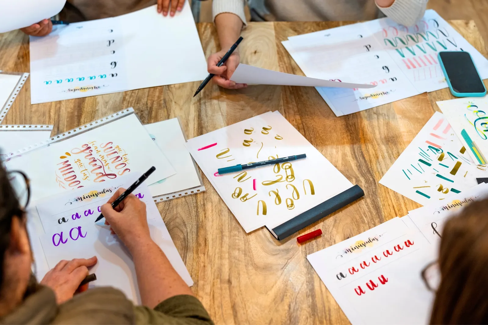
Typography matters for wine labels as it sets the tone and personality of the brand, establishing credibility and professionalism while communicating the overall vibe of the wine. The font choice has a significant impact on how consumers perceive the product, making it essential to choose wisely.
Sets the tone and personality of the brand
We know how crucial it is for wine labels to capture the essence of our brand. By selecting the right typography, we set a distinct tone and personality that resonates with our audience.
It’s about more than just words on a label; it’s about crafting an identity that speaks volumes before the bottle is even opened. Our choice of font can convey elegance, whimsy, tradition or innovation, guiding customers’ perception and setting expectations for the flavour and quality inside.
Our branding becomes memorable through carefully chosen label fonts that reflect our values and story. This attention to detail in wine label design not only attracts attention but also fosters a connection with our consumers.
As we move forward, establishing credibility and professionalism remains paramount in communicating the overall vibe of our wine.
Establishes credibility and professionalism
Selecting the right font for your wine label is crucial as it directly reflects the professionalism and credibility of your brand. The font you choose should align with the image you want to convey and appeal to your target audience.
A sophisticated and elegant font can communicate quality and expertise, while a more modern or fun font may reflect a youthful and innovative approach. Your choice of typography on the label will play a key role in establishing trust with consumers, indicating that your brand takes its product seriously, which can ultimately enhance your overall branding strategy.
When potential buyers see a wine label that has been thoughtfully designed with professional-looking typography, they are more likely to perceive it as a high-quality product worthy of investment.
Communicates the overall vibe of the wine
The font on a wine label conveys the style and mood of the wine. It captures attention from across the room and sets the tone for what to expect inside the bottle. The typography gives a visual representation of your brand’s personality, making it easy for customers to connect with your product.
By choosing fonts that reflect your wine’s character, you can effectively communicate its unique vibe and appeal to target consumers. When selecting fonts, consider how they align with your brand image and message, as this will create a cohesive look that resonates with customers. Fonts play a crucial role in capturing attention and communicating the essence of your wine.
Top Fonts for Wine Labels
When choosing fonts for wine labels, it’s essential to consider the vibe and personality of the brand. Fonts like Great Vibes offer a classic touch, while Andara Font brings a modern feel to the label design.
Classic: Great Vibes
When selecting a font for your wine label, the classic and elegant Great Vibes stands out as an excellent choice. This script font exudes sophistication and timeless charm, making it perfect for conveying a sense of refinement and luxury.
Its flowing strokes add a touch of grace to your label, capturing the attention of wine enthusiasts and setting your brand apart on the shelf.
Great Vibes font brings an air of tradition while maintaining a contemporary appeal that resonates with consumers seeking quality and class in their wine selection. Its decorative yet legible style complements various label designs, enhancing the overall aesthetic of your product packaging.
Vintage: Olden Times Font Bundle
Now, let’s delve into the vintage charm of the “Olden Times Font Bundle.” This font bundle brings a touch of nostalgia and elegance to wine labels, encapsulating a sense of tradition and heritage.
The timeless appeal and intricate detailing of this font evoke a classic allure that resonates with connoisseurs and collectors alike. Its graceful curves and ornate embellishments add a sophisticated flair to wine labels, making it an ideal choice for brands looking to convey a rich history and refined taste through their typography.
The Olden Times Font Bundle exudes an air of sophistication while paying homage to the winemaking traditions of yesteryears. Its elaborate serifs and decorative elements infuse labels with an old-world allure, evoking images of opulent vineyards nestled in picturesque landscapes.
Modern: Andara Font
Transitioning from the vintage charm of the Olden Times Font Bundle, let’s explore the modern allure of Andara Font. This font exudes contemporary elegance with its clean lines and sophisticated appeal.
Its sleek and stylish design makes it a perfect choice for wine labels that aim to convey a sense of refinement and luxury.
Andara Font’s geometric shapes and graceful strokes make it ideal for creating a minimalist yet impactful visual identity for your wine brand. Whether you want to convey sophistication or innovation, this font can help you achieve a modern and polished look that resonates with today’s discerning consumers.
Fun: Summer Wine Hand Drawn Font
The Summer Wine Hand Drawn Font adds a playful and lively touch to wine labels. It exudes a sense of warmth and relaxation, making it ideal for light-hearted, casual wine varieties.
This font creates an inviting and approachable vibe that appeals to the younger demographic. Its hand-drawn style conveys authenticity and artisanal craftsmanship, making it perfect for small-batch or boutique wineries looking to connect with consumers on a personal level.
With the Summer Wine Hand Drawn Font, your wine label can stand out with its unique charm and whimsical appeal. The font’s organic look captures the essence of summer days spent sipping chilled wines in the sun-kissed vineyards.
Business: Goodwine Font + Mockup
Enhance your wine label with the sleek and sophisticated Goodwine font, exuding professionalism and elegance. This modern font adds a touch of class and refinement to your brand, making it perfect for upscale or premium wine products.
The mockup feature allows you to visualise how the font will appear on your label, ensuring a stunning result that speaks volumes about your wine’s quality.
When selecting fonts for business use, it is crucial to consider not only aesthetic appeal but also legibility. The Goodwine font strikes the perfect balance between style and readability, making it ideal for conveying a sense of luxury while maintaining clear communication of essential information on your wine label.
How to Choose the Right Font for Your Wine Label
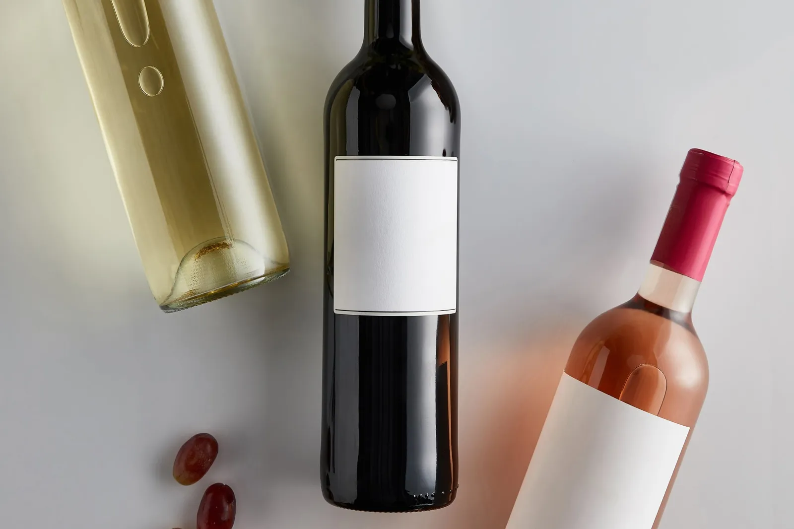
Consider the theme and overall design of your label carefully. Determine the size of your label before selecting a font. Create a well-designed back label that complements the font on the front.
Choose colours and paper materials that enhance the font you select, then get your label approved and printed.
Consider the theme and overall design of the label
When choosing a font for your wine label, it is essential to consider the theme and overall design of the label. The font should complement and enhance the visual elements, such as imagery, colours, and layout.
This ensures that the typography aligns with the brand’s personality and speaks directly to your target audience.
By considering these aspects first, you can select a font that not only looks attractive but also conveys the right message about your wine. It’s crucial that your chosen font reflects the essence of what makes your product unique and stand out on crowded shelves.
Know the size of your label
Before choosing a font, measure the dimensions of your wine label to ensure that the typography fits perfectly. The font size and style should harmonise with the label’s size, making it readable and visually appealing.
Larger fonts may overwhelm a smaller label, while tiny fonts might be illegible on a larger one. Consider the placement of text elements like brand name, varietal, or region to maintain a balanced look across different label sizes.
Understanding your label size is crucial for selecting an appropriate font that complements the overall design. Whether it’s for a standard 750ml bottle or a unique shape or format, knowing your label size enables you to make an informed decision when choosing typography.
Create a well-designed back label
After knowing the size of your label, it’s time to focus on creating a well-designed back label. This space is valuable real estate for providing additional information about the wine, such as tasting notes, food pairings, or the winemaker’s story.
Utilise this area to enhance brand storytelling and provide consumers with helpful details that can influence their purchasing decisions.
Craft a back label layout that complements the front design and font choice. Use legible typography and consider incorporating visual elements like icons or borders to break up text and make it more visually appealing.
Choose colours and paper materials that enhance the font
When creating a well-designed back label, it is important to choose colours and paper materials that enhance the font. The right pairing of font, colour, and paper can make your wine label stand out on the shelf.
Consider using complementary colours to make the font pop and selecting a high-quality paper that complements the overall design.
Using vibrant colours can draw attention to key information on the label, while muted tones create an elegant and sophisticated look. Additionally, choosing textured or specialty papers can add a tactile element that elevates the overall aesthetic of your wine label design.
Get your label approved and printed
Once the perfect font for your wine label is chosen, it’s time to ensure that the design complies with labelling regulations. Submit the label to the appropriate regulatory agency and obtain approval before proceeding with printing.
Once approved, proceed with finding a reputable printing service that specialises in wine labels using high-quality materials and finishes.
Before finalising your order, request a printed proof of the label to ensure colour accuracy and text legibility. When satisfied with all aspects of the label, place your order for production ensuring enough lead time for delivery.
Elegance in Your Wine Labels
Choosing the right font for your wine label is crucial. It sets the tone, personality, and credibility of your brand. Each font conveys a different vibe and can make or break the overall look of your label.
Consider the theme, size, and design to ensure it complements your wine bottle perfectly. Take time to select the right font and contact us for the right font that will speak volumes about your product.
Contact
Talk to us about your label
Tell us about the wine, the run size and any deadline you are working to.