Minimalist Chic with the Rise of Simplicity in Wine Label Art
We’ve clocked that there’s a fair dinkum craving for sleeker, more polished wine labels out there in the sea of choice. Just like you lot, we’re over the moon about how a touch of minimalist class can make a bottle stand out from the rest.
We’ve taken a proper squiz into how this trend’s been shaping up and changing the game for winemakers and connoisseurs alike. Our yarn unwraps the old label to show you how keeping things simple is setting new benchmarks in elegance across the grapevine – it’s something you won’t want to miss.
Key Takeaways
- Artists are shaking up the wine market by creating bold label designs that tell a story and add sophistication to wine bottles
- Indigenous art organisations in Gimuy/Cairns are crucial for promoting cultural heritage, offering winemakers authentic artworks for labels that resonate with consumers and honour Australian traditions.
- The minimalist trend in wine label design is attracting Millennials who value clean aesthetics, authenticity, and sustainability, leading to timeless branding and potentially more eco-friendly packaging options.
- COVID-19 has prompted innovations in wine label design geared towards e-commerce efficiency, including interactive augmented reality features on labels and designs optimised for online shopping visibility.
- Adapting packaging and labelling approaches for different markets involves understanding regional tastes, complying with local regulations, accurately translating content where necessary, and considering suitable materials for various climates.
The Influence of Artists on Wine Label Art
By changing the wine market, artists have been making a significant impact on wine-label art. From the bold and vibrant creations of James’s favourite artist labels to the thought-provoking exhibition review of Built Geologies by Nicholas Burridge, it’s clear that artistic influence is shaping the industry.
Changing the wine market
We’ve seen firsthand how bold artists are shaking up the wine market with their creative label art. Their work is not just about catching the eye; it’s about telling a story that resonates with buyers and sets one bottle apart from another on crowded shelves.
This shift towards more artistic and abstract wine label design isn’t a trend, it’s a movement that reflects our customers’ desire for sophistication and aesthetic appeal, alongside the taste of quality wine.
Our favourite Australian artist-designed labels bring hidden meanings to life, offering an extra layer of intrigue for consumers to explore. By incorporating minimalist chic into our brands, we’re appealing directly to those who value simplicity and elegance in every sip they take.
As we merge art with the craft of winemaking, we’re redefining what it means to stand out in the industry, showcasing our commitment to culture, style, and innovation through each unique wine label we create.
James’s favourite artist wine labels
James, our resident wine connoisseur, has curated a list of his favourite artist wine labels that have made waves in the industry. These labels stand out for their unique artistic expression and captivating design. Let’s take a look at his top picks:
- Renowned artist Damien Hirst’s collaboration with a prestigious winery resulted in a label adorned with his iconic butterfly motif, symbolising new beginnings and transformation in the context of wine consumption.
- Local Australian artist Emily Kame Kngwarreye’s artwork graced a limited edition wine label, showcasing vibrant indigenous motifs that celebrate traditional Australian culture while adding an artistic flair to the product.
- The captivating label by contemporary artist Yayoi Kusama features her trademark polka dots, infusing the wine bottle with an electrifying visual appeal that captures attention on store shelves and social media feeds alike.
- Noted for its minimalist elegance, the label designed by renowned graphic artist Milton Glaser exudes sophistication and understated luxury, attracting discerning consumers seeking refined wine branding experiences.
- Acclaimed painter Georgia O’Keeffe’s evocative floral masterpieces have been ingeniously transformed into stunning wine labels, offering consumers an immersive sensory experience that transcends the boundaries of traditional label art.
Exhibition review: Built Geologies by Nicholas Burridge
A contemporary exhibition review, Built Geologies by Nicholas Burridge, offers a fresh perspective on artistic expression.
The collection masterfully captures the essence of geological formations through abstract forms and intricate textures. Burridge’s use of vibrant colours and bold lines brings an innovative approach to traditional landscape interpretations, offering potential inspiration for wine label design ideas.
His dynamic artwork exudes creativity that may resonate with wine business owners seeking minimalist wine label designs with hidden meanings or unique artistic expressions. As minimalism continues to rise in popularity within the wine industry, exploring diverse artistic influences such as those found in Built Geologies can provide valuable insights into captivating label artwork that appeals to modern consumers.
The State of Indigenous Art Organisations in Gimuy/Cairns
We discuss the current state of Indigenous art organisations in Gimuy/Cairns and provide insights from the 2024 Arts Conference and Summit Planner. Read on to learn about the important role these organisations play in preserving and promoting Indigenous art in Australia.
A discussion on the state of Indigenous art organisations
Indigenous art organisations play a vital role in preserving and promoting the cultural heritage of Australia. These organisations provide platforms for Indigenous artists to showcase their talent and share their stories through art.
By supporting these organisations, wine businesses can contribute to the preservation of Indigenous art forms while also gaining access to unique and culturally significant artwork that can be featured on wine labels.
This partnership not only fosters diversity and inclusion but also elevates the brand image by aligning with meaningful artistic expressions.
Understanding the state of Indigenous art organisations is essential for wine companies looking to collaborate with artists for label designs. It involves recognising the challenges faced by these organisations, such as funding constraints and access to resources while appreciating their contributions to Australia’s cultural landscape.
Related news from the 2024 Arts Conference and Summit Planner
- The conference featured engaging discussions on emerging trends in wine label art, emphasising minimalist and artistic designs that resonate with modern consumers.
- Renowned experts showcased innovative approaches to integrating indigenous art and traditional wine label design, providing invaluable insights for those seeking to infuse cultural depth into their wine labels.
- Presenters delved into the impact of COVID-19 on wine label art, exploring potential packaging innovations and the evolving landscape of e-commerce about label design.
The Rise of Minimalist Wine Label Art
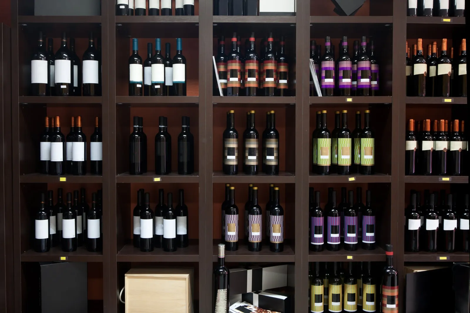
The trend towards simplicity in wine label art is on the rise, as more consumers are drawn to minimalist designs. With its clean and modern aesthetic, minimalist wine labels appeal to the Millennial generation and offer a fresh take on traditional label art.
The trend towards simplicity in wine label art
The move towards simplicity in wine label art is evident in the industry, with a growing number of wineries opting for minimalist designs. This shift allows labels to stand out on shelves and appeal to a broader audience, especially the Millennial generation who appreciate clean, modern aesthetics.
Embracing minimalism can also convey an air of sophistication and elegance, attracting consumers seeking a more refined and upscale experience. By focusing on key elements and utilising negative space, wineries can create impactful labels that capture attention and leave a lasting impression.
In response to changing consumer preferences and market trends, many wine businesses are exploring minimalist approaches to label design as they seek to distinguish their products in the competitive marketplace while aligning with contemporary tastes.
Benefits of minimalist wine labels
The minimalist wine labels provide a modern and sophisticated look. They easily stand out amongst crowded shelves. The simple designs draw attention to the quality of the wine inside.
- Emphasises the Quality: With fewer distractions, the focus shifts to the winery’s branding and the essence of the wine.
- Versatility: Minimalist labels are versatile and can cater to a wide range of audiences, making them suitable for various types of wines and occasions.
- Timelessness: Clean and simple designs have a timeless appeal, ensuring that your brand remains relevant for years to come.
- Eco-Friendly: Minimalist labels often require less material and ink, contributing to sustainable packaging practices.
- Memorable Branding: These labels offer a unique opportunity for distinct brand recognition, becoming memorable in consumers’ minds.
- Cost-Effective: Simplistic label designs can reduce printing costs without compromising on visual impact.
- Enhanced Readability: Clear typography and uncluttered layouts make information on the label easy to read, helping consumers make informed purchasing decisions.
How it appeal to the Millennial generation
Wine business owners must understand how this appeals to the Millennial generation. With their preference for clean and modern aesthetics, Millennials are drawn to the simplicity and sophistication of minimalistic wine label art.
This generation appreciates authenticity, individuality, and uniqueness in design, making them more inclined towards artistic representations that convey hidden meanings or stories through understated elegance.
By embracing minimalist chic in wine label art, businesses can tap into the Millennial market and create a strong appeal among this influential demographic.
Crafting wine labels with minimalist designs also aligns with the eco-conscious values held by many Millennials. The sleek simplicity not only reflects their taste for contemporary style but also resonates with their desire for sustainable practices and reduced environmental impact.
The Impact of COVID-19 on Wine Label Art
The pandemic has spurred potential innovations in packaging and label design, as well as the rise of e-commerce influencing label design for physical and online stores. Read more about how COVID-19 is impacting wine-label art in our blog!
Potential innovations in packaging and label design
- Incorporating eco-friendly materials for sustainable packaging, aligning with the growing environmental consciousness among consumers and meeting the demand for sustainable products.
- Adopting augmented reality technology on wine labels to provide interactive experiences for customers, creating a unique and engaging way to showcase the brand story or winemaking process.
- Utilising minimalist designs that convey elegance and modernity, reflecting the shift towards simplicity and sophistication while standing out on shelves or online platforms.
- Personalising labels with customisable options, allows customers to add their touches such as messages, images or QR codes, enhancing the personal connection with the product.
- Embracing tactile elements on labels through embossing, texture or unique finishes that offer a sensory experience, creating a memorable impression and adding value to the overall product.
- Exploring innovative label shapes and unconventional placements to break away from traditional standards, drawing attention and sparking curiosity among consumers.
- Investing in smart packaging technologies like temperature-sensitive ink or NFC tags for tracking provenance, ensuring product quality and authenticity while providing an added layer of transparency for customers.
The rise of e-commerce and its influence on label design
E-commerce has changed the game for wine label design. We’ve noticed that labels now need to stand out not just on store shelves, but also in online thumbnail images. Digital shopping means that labels have to pop and draw attention at first glance.
Therefore, there’s a growing trend toward minimalist designs, clear fonts, and bold colours – all these aspects contribute to an eye-catching label design that is easily readable even in small digital images.
The rise of e-commerce has also made it crucial for wine labels to convey a compelling story or message quickly. Labels must communicate brand ethos and product differentiation clearly through impactful visuals and concise language.
Different approaches for physical and online stores
When designing wine labels for physical stores, it’s important to consider shelf appeal and visibility. Using eye-catching designs and clear typography can help your product stand out among competitors.
For online stores, focus on creating label designs that look appealing in digital form, with attention to detail and high-resolution images that pop off the screen. Consider how your label will appear on mobile devices as well, given the increasing trend of online shopping via smartphones.
To cater to physical and online stores effectively, we recommend testing label designs across various platforms to ensure they maintain their appeal in both settings. Additionally, incorporating QR codes or augmented reality elements can enhance the customer experience for online shoppers while maintaining a minimalistic yet sophisticated look for physical retail environments.
Considerations for designing labels for different markets
When designing wine labels for different markets, it’s crucial to consider cultural preferences and aesthetic sensibilities. Understanding the specific tastes and design trends of each market can help tailor labels to appeal to diverse consumer bases.
Additionally, keeping in mind linguistic diversity is essential when creating labels for international markets, ensuring that the content is accurately translated and culturally appropriate.
Adapting label designs based on regional regulations and requirements is also important; this includes adhering to specific labelling laws and standards unique to each market. Moreover, considering packaging materials suitable for different climates and transportation methods can ensure that the label maintains its quality during distribution across various regions.
Simplicity is Beauty
In conclusion, the rise of minimalist wine label art has redefined the industry, capturing attention and sparking curiosity. This trend not only offers a fresh take on branding but also appeals to a new generation of wine enthusiasts.
Wine business owners now have an opportunity to embrace simplicity in their label designs, making a bold statement in the market. Engage with us as we continue to witness this evolution, it’s clear that minimalism is here to stay as a powerful force in wine label art.
Contact
Talk to us about your label
Tell us about the wine, the run size and any deadline you are working to.