
How Do Texture and Finish (Foil, Emboss, Matte) Affect Wine Label Perception
Texture and finish influence how a wine label is viewed and compared with others. Foil reflects light and gives a bright surface that indicates detail and precision. Embossing creates a raised surface that shows physical depth and highlights key design elements. Matte coatings remove gloss and reduce glare, which improves readability under lighting.
Each finish changes how the label appears on the shelf and how easily information can be seen. Texture and finish also guide visual hierarchy by drawing attention to names, logos or patterns. Consistent use of these elements supports clear branding and product identification.
Texture Creates a Sense of Quality
A textured surface adds grip and makes the label easier to handle, while a smooth surface gives a flat and uniform finish. Both options affect how the label performs under lighting and during application.
Textured paper reduces glare and shows small variations in the surface, which can make design details clearer. Smooth paper allows for precise printing and easier cleaning during production. Each type has its own benefit depending on the look and function the brand wants to achieve.
Keeping the same paper texture across a product range helps maintain a consistent appearance on shelves and supports clear brand recognition.
Foil Adds Luxury and Attention
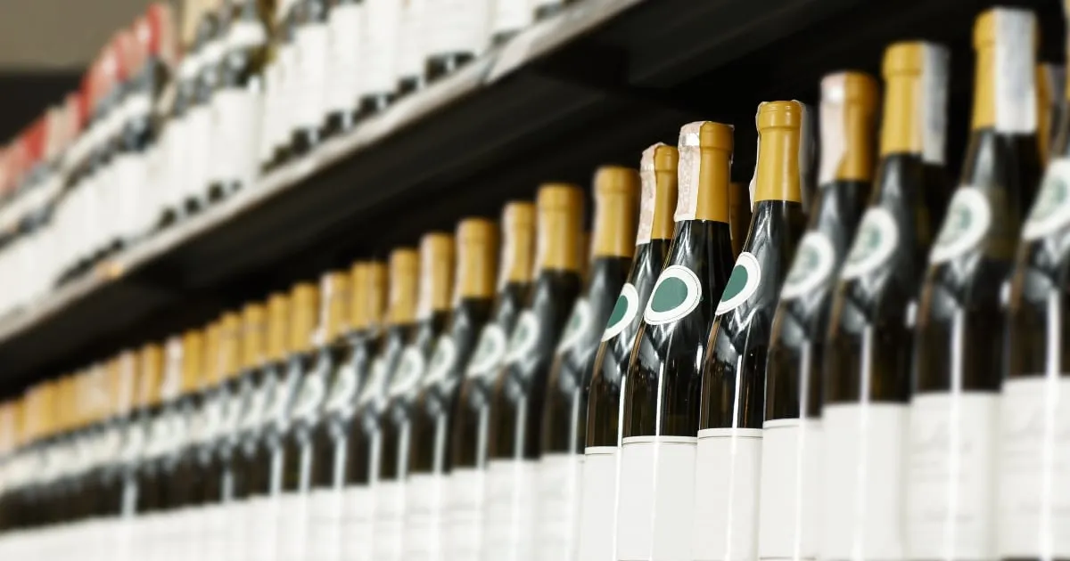
Foil stamping uses a thin metallic layer pressed onto the label surface with heat. It highlights specific design elements such as logos, borders, or names. The process adds colour contrast and helps important details remain visible under different lighting conditions.
Foil is available in various colours, including gold, silver, copper and tinted shades. Choosing the right foil tone depends on the label design and printing surface. Metallic foil reflects light differently based on the angle, which gives a noticeable distinction between flat and printed areas.
Using foil in moderation keeps the design readable and prevents glare. When applied to text or small icons, it can improve legibility and support clear brand presentation. Proper alignment during application ensures clean edges and accurate registration with other design elements.
Embossing Adds Depth and Tactile Interest
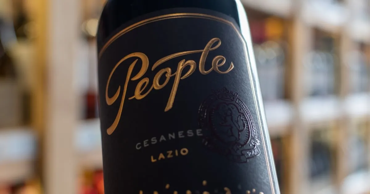
Embossing raises selected areas of the label surface to create a physical impression. It is often used for logos, borders or text that require emphasis without using colour. The raised effect is produced through pressure and heat, forming a three-dimensional structure on the paper.
This process adds a tactile element that changes how the label feels when handled. Embossed details can help distinguish one product from another, particularly when combined with textured paper or foil. The depth of embossing must be measured carefully to avoid distortion or cracking during printing and application.
Embossing is most effective when used sparingly. Applying it only to key elements maintains balance and prevents uneven adhesion. Consistent embossing across a range also helps reinforce brand recognition and visual order.
Matte Finishes Feel Modern and Understated
A matte finish reduces surface reflection and gives a smooth, non-gloss appearance. It helps improve label readability under direct light and provides a clean surface that suits many design styles.
Matte coatings can be applied as a laminate or spray varnish, depending on production requirements. They protect the print surface from scratches and moisture without changing the colour balance of the design. This finish also allows fine details such as small fonts and thin lines to appear clearer than on glossy surfaces.
Matte finishes work well for brands that prefer a simple and neat presentation. They can be paired with textured paper or foil details to create visible contrast between surfaces without affecting print clarity.
Combining Finishes for Maximum Impact
Different finishes can be applied together to achieve clear structure and emphasis within a label design. Foil, embossing and matte coatings each serve a specific purpose, and combining them highlights important details while keeping the layout balanced.
Foil can outline headings or key shapes, while embossing adds physical depth to selected areas. A matte coating can be layered over these finishes to reduce reflection and protect the printed surface. Testing during production confirms that each layer aligns correctly and performs as intended.
Using multiple finishes can improve visibility and define label sections more clearly. Accurate placement and alignment during printing ensure all elements remain consistent across bottles. Wine Design’s personalised wine bottles are professionally labelled and printed in Australia.

Consistent Finishes for Clear Presentation
Texture and finish affect how a wine label performs, both visually and during handling. Each method, whether foil, embossing or matte coating, serves a practical purpose in improving visibility, structure and brand consistency.
Using the right combination of finishes helps maintain clear design hierarchy and ensures that the label applies correctly to the bottle surface. Consistency across a product range also supports recognition and simplifies future printing or updates.
Contact Prestige Wine Labels for assistance with wine label finishes suited to your packaging design and production needs.
Frequently Asked Questions
What factors determine the best finish for a wine label?
The choice depends on print method, label material, lighting conditions and how the bottle will be stored or displayed.
Can matte coatings be used with other finishes?
Yes. Matte coatings can be layered over foil or embossing to protect printed areas and control light reflection.
Do all paper types support embossing and foil?
No. Thicker paper is required to hold embossed patterns, and certain coatings may limit foil adhesion. Testing during production ensures compatibility.
How can finishes affect label durability?
Finishes protect against moisture, scratching and handling. Selecting the right coating helps maintain label appearance during transport and storage.
Why is finish consistency important across a product range?
Using the same finishes across all bottles helps maintain uniform presentation and simplifies colour and texture matching in future print runs.
Contact
Talk to us about your label
Tell us about the wine, the run size and any deadline you are working to.