
The Psychology of Colour on Wine Labels
Oh, we’ve all been there – standing in the wine aisle, faced with a sea of bottles and not a single clue where to start. You might not realise it, but sometimes it’s just the colour of the label that has us reaching for one bottle over another.
Yeah, it’s true – a large share of our quick decisions about products like wine are swayed by the hues alone! But don’t worry; we’re here to help you navigate through this colourful maze.
We’ll share some savvy tips so your wines won’t just be picked up by chance but will truly resonate with your customers and find a place right at their tables. It’s time to pop open the wisdom of colour psychology!
Key Takeaways
- Colour on wine labels sets expectations for flavour and quality before tasting, with certain colours like reds suggesting richness while blues hint at crispness.
- Knowing the target audience helps in selecting colour schemes and typography to create appealing labels that influence purchasing decisions effectively.
- Advances in design and technology, such as digital printing and augmented reality, open new avenues for creative label designs that stand out.
- Understanding cross-cultural perceptions of colour can help businesses appeal to a global market by ensuring their wine label designs are inclusive and culturally sensitive.
- An attractive label boosts consumer confidence in their choice of wine, impacting buying behavior positively.
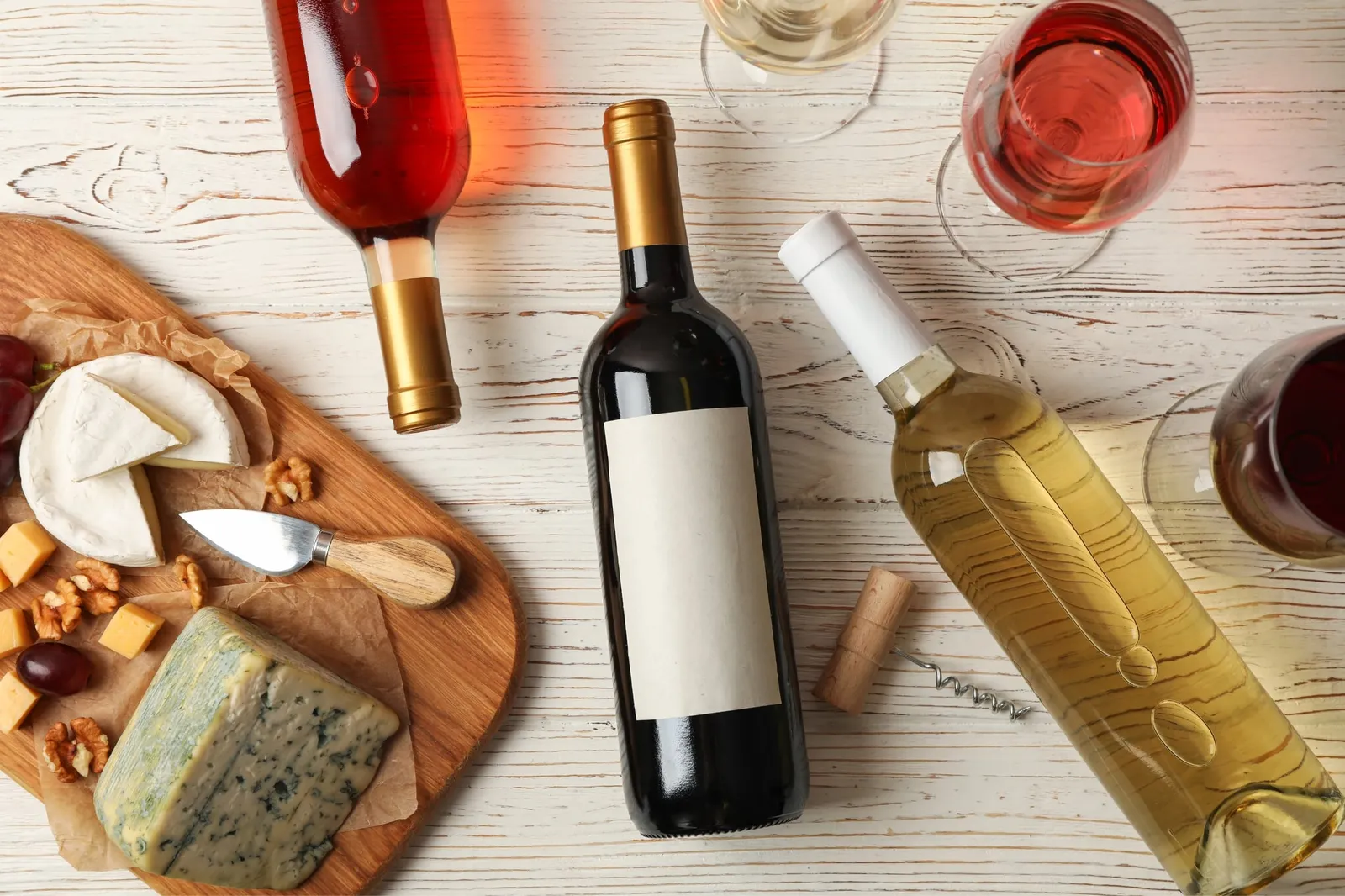
The Impact of Colour on Wine Labels
When it comes to wine labels, colour plays a significant role in shaping sensory expectations and perceptions. Understanding the impact of colour on wine labels can help wine companies influence consumer behaviour and product perception.
Sensory expectations and perceptions
We understand that the visual appeal of wine labels plays a pivotal role in shaping sensory expectations. The moment consumers glance at a bottle, the colours leap out, suggesting flavour notes and quality without them even realising it.
Think about reds and golds; they signal richness and warmth, priming taste buds for a bold experience. Meanwhile, cool hues like blues or greens might set up an anticipation for crispness before a wine is even uncorked.
Our design choices directly influence perceptions of what’s inside the bottle. If we opt for a whimsical design on our packaging, it sets an entirely different mood compared to minimalist or prestige aesthetics.
We’re not just selling wine; we’re offering an experience that starts with the eyes. It’s essential to ensure every aspect of our label matches what customers expect from the aroma to the last sip – this alignment impacts satisfaction and can turn first-time buyers into loyal enthusiasts.
Crossmodal correspondences
Our team understands the significance of crossmodal correspondences in wine label design. When we harmonise visual elements, such as colour and typography, with the sensory expectations and perceptions associated with a particular wine, we create a powerful marketing tool.
By leveraging crossmodal correspondences effectively, our labels can evoke specific flavour expectations and quality associations even before the bottle is opened. This strategic use of sensory cues enhances not only product presentation but also influences consumer purchasing decisions.
As industry professionals, it’s essential for us to recognise that crossmodal correspondences influence how consumers perceive and evaluate wines based on packaging alone. Our understanding of these psychological processes allows us to create label designs that authentically represent the taste experience within the bottle while resonating with our target audience’s preferences and expectations.
The role of colour in packaging and product perception
Colour plays a crucial role in packaging and product perception. The right choice of colour can evoke specific emotions and create sensory expectations in consumers. For wine labels, colour can influence flavour expectations, quality perceptions, and even the perceived prestige of the brand.
This highlights the significance of selecting colours that align with your target audience’s preferences while considering cross-cultural studies to ensure your packaging resonates with diverse consumer groups.
Utilising colour psychology effectively on wine labels can significantly impact purchasing decisions. Understanding the psychological associations behind colours allows for strategic branding that appeals to mass-market wines as well as niche products aiming to convey a sense of luxury or exclusivity.
How to Use Colour and Typography to Influence Buyers
When it comes to influencing buyers, it’s important to know your target audience and choose the right colour and typography for your wine label. Utilising icons and other design elements can also play a significant role in creating a visually appealing label that attracts consumers.
Knowing the target audience
Understanding your target audience is crucial when designing wine labels. Consider the demographics and preferences of your potential customers, including their age, income level, and lifestyle.
Are they traditional or more adventurous in their wine choices? By knowing who you are targeting, you can tailor the colour schemes and typography to attract their attention and influence their purchasing decisions.
Analysing consumer behaviours will help you create label designs that resonate with your target market. Conduct market research to gain insights into what appeals to your audience visually.
Choosing the right colour and typography
When creating wine labels, it is essential to consider the impact of colour and typography on consumer perception.
- Understand the target audience: Articulate a clear understanding of your target consumers’ preferences, cultural influences, and emotional triggers to align with their expectations.
- Select suitable colours and typography: Use colours that evoke the desired emotions and match the brand identity while ensuring readability. Typography should complement the overall design and convey the intended message effectively.
- Utilise icons and other design elements: Incorporate relevant icons or symbols that resonate with your target audience, further strengthening the visual appeal of the label.
- Enhance shelf presence: Stand out by utilising contrasting colours and fonts that draw attention in a crowded market space while maintaining coherence with your brand’s image.
- Convey quality and prestige: Employ colour schemes and typography that reflect elegance, sophistication, and premium quality to attract discerning consumers.
The use of icons and other design elements
Having chosen the right colour and typography to appeal to your target audience, ensure that your wine label design incorporates relevant icons and other design elements. These could include symbols that reflect the wine’s characteristics or origin, such as grapevine illustrations for a vineyard-specific product or regional landmarks for wines with a local connection.
Icons can effectively convey information about flavour profiles, sustainability practices, or certifications in a visually appealing manner. Furthermore, integrating other design elements like unique textures or embossing can elevate the tactile experience of interacting with your wine label, adding an extra layer of sensory perception that reinforces the overall brand image.
To maximise the impact of icons and design elements on wine labels, consider how they complement the chosen colour scheme and typography while still ensuring clarity and readability.
The Importance of Wine Labels in Consumer Purchasing Decisions
The label plays a crucial role in consumers’ purchasing decisions, especially in retail settings and with the current trends in wine consumption. To find out more about how your wine label can influence buyers, read on.
Current consumption trends
Wine consumption trends are constantly evolving, with an increasing interest in niche and boutique wines. Consumers are looking for unique flavour profiles and sensory experiences, driving the demand for visually appealing wine labels that convey a sense of quality and artistry.
As wine enthusiasts seek out new and exciting products, the role of label design becomes even more crucial in capturing their attention. With an emphasis on storytelling through visual appearance and typography, wine companies can leverage current consumption trends to create labels that resonate with their target audience.
Understanding these shifts in consumer preferences allows wine business owners to tailor their label designs accordingly, ensuring they stay relevant and competitive within the market.
By incorporating the right colours, typography, and design elements that align with current tastes, winemakers can effectively influence buyers’ flavour expectations while enhancing their product’s appeal on store shelves or online platforms.
Keeping up with these changing consumption patterns will be pivotal in shaping future marketing strategies and maintaining a strong brand presence.
Role of labels in retail stores
The role of labels in retail stores is crucial to catching the eye of potential wine buyers. Clear and appealing wine labels can attract customers and influence purchasing decisions.
When designing wine labels for retail, it’s important to consider the sensory expectations and perceptions that colours evoke in consumers. Additionally, the typography used on a label plays a significant role in conveying product information and creating an emotional connection with buyers.
Remembering that packaging greatly impacts consumer expectations, using strategic colour choices and font styles can significantly influence buyer behaviour.
In retail environments, where consumers are often faced with numerous options, a well-designed label can make a standout impression. It’s important to leverage current consumption trends by ensuring your wine label aligns with customer preferences.
The influence of packaging on consumer expectations
Considering the role of labels in retail stores, it becomes crucial for wine business owners to understand the influence of packaging on consumer expectations. The choice of label and packaging design significantly impacts consumers’ perceptions and purchasing decisions.
When contemplating wine label design, it’s essential to consider how the overall presentation conveys quality, taste, and brand identity.
The packaging not only serves as a protective vessel for the product but also communicates important information about the wine inside. Consumers often form initial impressions based on packaging, influencing their expectations regarding flavour and quality before they even sample the product.
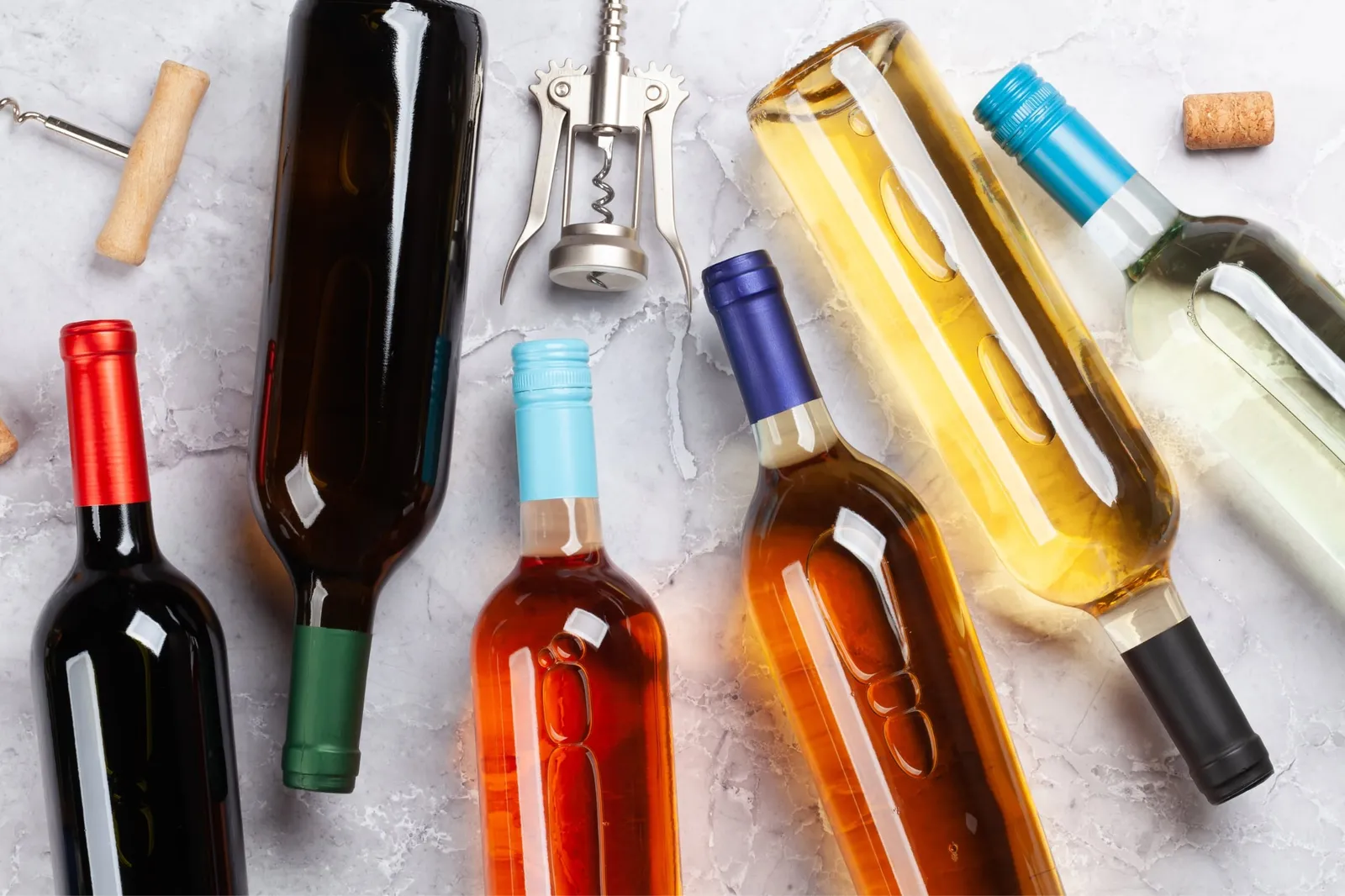
The Future of Wine Label Design
Advances in technology and design have opened up new possibilities for wine label design, allowing for more creative and engaging packaging. Cross-cultural studies on the influence of colour and typography on consumer purchasing decisions are shedding light on how wine labels can appeal to a global audience.
Advances in technology and design
Technology and design continue to play a crucial role in wine label development. Innovations such as digital printing have enabled more intricate and vibrant designs, allowing us to create labels that stand out on the shelves.
With advancements in label materials, we can now experiment with unique textures and finishes, enhancing the tactile experience for consumers when they interact with our products.
In addition, technology has enabled the integration of augmented reality into label design. This interactive element offers an exciting way to engage consumers and share compelling brand stories, creating memorable experiences that resonate with buyers long after they’ve made their purchase decisions.
The role of multisensory perception in label design
The use of multisensory perception in label design allows for a deeper connection with consumers, impacting their overall experience with the product. By incorporating visual, tactile, and olfactory elements into wine labels, we can engage multiple senses simultaneously, enhancing the consumer’s perception of the wine’s quality and desirability.
Through this approach, we create an opportunity to evoke specific emotional responses and heighten sensory expectations that influence purchasing decisions.
Through strategic use of colour, texture, and even scent on labels, we can create a holistic brand experience that resonates with consumers on a subconscious level. This approach is especially important in the competitive wine market where differentiation is key to standing out amidst numerous choices available to consumers.
Cross-cultural studies and their implications
Understanding cross-cultural studies and their implications is crucial in the design of wine labels. By acknowledging cultural differences in colour perception and symbolism, wine companies can effectively tailor label designs to resonate with diverse consumer groups.
This involves recognising how various colours are interpreted across different cultures, ensuring that labels convey universal messages that appeal to a wide audience. Moreover, leveraging insights from cross-cultural studies can aid in creating inclusive and culturally sensitive packaging that fosters positive consumer experiences, ultimately influencing purchasing decisions.
Recognising the impact of cross-cultural studies on label design allows wine businesses to navigate global markets with confidence. It ensures that labels are not only visually appealing but also respectful of cultural nuances, thereby enhancing brand reputation and customer engagement.
The influence of packaging on consumer decisions and self-confidence
Packaging plays a crucial role in the consumer’s decision-making process. Attractive wine labels and packaging design are essential in catching consumers’ attention, influencing their purchasing decisions, and boosting their self-confidence in their choice of product.
The visual appeal of the packaging creates an immediate impression on consumers, shaping their perception of the wine before they even taste it. This first impression significantly impacts their overall experience with the brand.
Engaging and visually appealing packaging not only influences consumer decisions but also enhances their confidence in the quality of the product inside. Striking designs create a positive association with the brand, instilling trust and satisfaction when making a purchase decision.
Discover More about Colour in Wine Labels
In conclusion, understanding the psychology of colour on wine labels can significantly influence consumer perceptions and purchasing decisions. Wine businesses should consider the impact of colour and typography to appeal to their target audience and create a strong brand identity.
As technology advances, the future of wine label design holds exciting possibilities for creating multisensory experiences that resonate with diverse cultural preferences. Embrace these insights into label design with us to enhance consumer confidence in their wine selections while also reflecting evolving consumption trends.
Contact
Talk to us about your label
Tell us about the wine, the run size and any deadline you are working to.