
What Typography Choices Help Wine Labels Convey Premium Quality
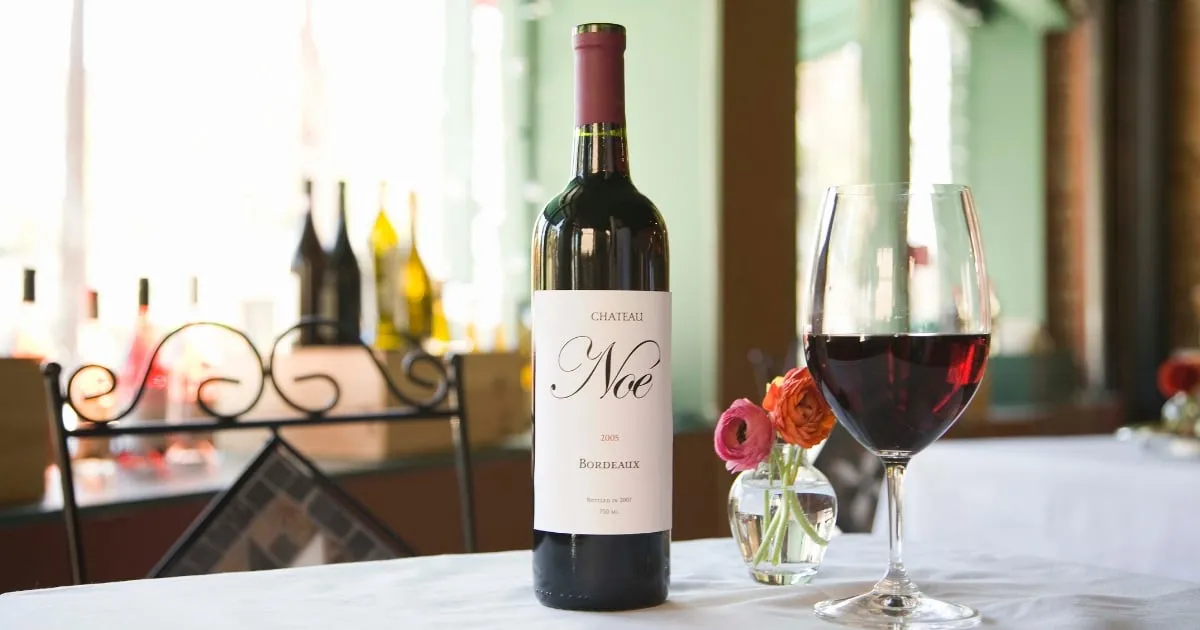
Wine labels convey premium quality through typography that is simple, legible, and consistent with the brand’s personality. Fonts with balanced proportions, clean lines, and clear spacing make a label look refined while remaining easy to read from a distance.
Serif fonts often communicate tradition and craftsmanship, while sans-serif styles give a modern and minimal look. Combining both can create contrast that draws attention to key details such as the wine name or vintage.
Effective typography relies on balance and hierarchy. When the font, spacing, and layout work together, the label feels cohesive and professional, helping buyers associate the wine with care and authenticity.
Start with Readability
Readability is the foundation of effective wine label design. If the text is hard to read, even the most beautiful layout can lose its impact. Every element from the wine name to the variety and origin, should be clear at a glance.
Readable fonts have open shapes, balanced spacing, and a consistent stroke weight. Serif typefaces like Garamond or Caslon work well for traditional brands, while clean sans-serif fonts such as Helvetica or Futura suit modern labels.
Avoid using overly decorative fonts for main details. They can make the label look cluttered and difficult to read, especially on smaller bottles. Save those styles for accent text, such as the winemaker’s name or signature line.
Match the Font to the Brand Story
Typography should reflect the story and personality of the wine. The right font can communicate emotion, history, and craftsmanship before the bottle is even opened.
A classic serif font suits heritage wineries or traditional blends, giving a sense of depth and legacy. Clean sans-serif styles fit modern labels, expressing precision and simplicity. For boutique ranges, a subtle handwritten typeface can convey authenticity when used sparingly and balanced with readable text.
Maintaining consistency across all bottles is essential to building recognition. Businesses producing corporate or event wines can also apply these same principles using corporate labelled products to ensure every label reflects the brand’s professional image.
Use Hierarchy to Guide the Eye
Typography hierarchy helps direct attention to the most important information first. A clear visual order makes it easier for customers to identify the wine name, variety, and region at a glance.
Start by defining which details need emphasis. The wine name should stand out most, often with a larger size or bold weight. Supporting information, like the vintage and variety, can use smaller or lighter type.
Spacing also plays a role. Adequate distance between text groups prevents crowding and makes the label easier to scan. When the layout flows naturally, it creates a sense of balance that reflects the quality of the wine itself.
Small Details Make a Big Difference
Minor adjustments in typography can change how a wine label feels. Kerning, line spacing, and alignment all influence how polished the design looks. Even subtle inconsistencies can distract from an otherwise refined label.
Letter spacing should be wide enough to keep words legible but tight enough to maintain structure. Consistent alignment across text blocks gives the design a professional, intentional appearance.
Finishing touches, such as embossing or foil on key words, can make text feel more tactile and premium. These details draw the eye naturally without overwhelming the overall design.
The Material Matters Too
Typography looks different depending on the material it’s printed on. The texture, finish, and colour of the label can affect how the font appears under light and from different angles.
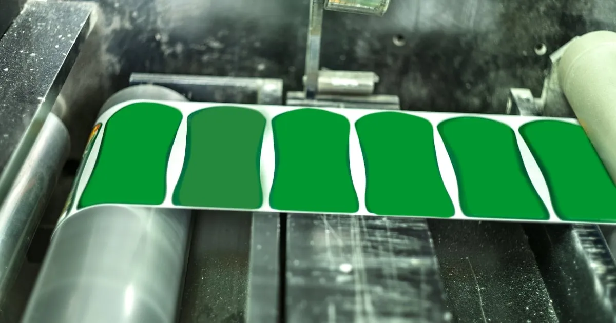
Smooth, matte paper often highlights crisp type, while textured stock softens edges and gives a more handcrafted feel. Metallic or foil finishes can draw attention to key text, but should be used carefully to avoid glare or reduced legibility.
Before final printing, test how your chosen font appears on the actual label material. This step ensures that spacing, contrast, and ink absorption all work together to maintain readability and visual consistency.
Pairing Typography with Colour and Layout
Typography works best when it complements the label’s colour palette and layout. The interaction between text and background determines how easily the design is read and how well it captures attention.
Dark text on a light background is generally easier to read, while lighter text on deep tones can create contrast and depth. The key is ensuring the font colour aligns with the brand style, whether warm and traditional or sleek and modern.
Spacing and placement also matter. Balanced margins and alignment guide the eye naturally across the label, keeping information clear without visual clutter. Typography, colour, and layout should feel like one cohesive design, not separate elements competing for attention.
Create Premium Labels with Prestige Wine Labels
Prestige Wine Labels helps Australian wineries create designs that reflect craftsmanship and consistency through thoughtful typography and precise printing. The focus is on clean layout structure, balanced spacing, and material choices that support each label’s visual identity.
Every project is developed with attention to proportion, texture, and finish, resulting in wine labels that look cohesive, professional, and suited to both boutique and commercial markets.
Frequently Asked Questions
What makes typography important in wine label design?
Typography sets the tone for how a wine is perceived. The choice of font style, size, and spacing communicates the brand’s character and influences a buyer’s first impression.
How do fonts affect the perception of wine quality?
Well-chosen fonts create balance and professionalism. Serif styles can imply craftsmanship and heritage, while clean sans-serifs suggest precision and modern production.
Should all wines in a range use the same font?
Using a consistent font family across a range strengthens brand recognition. Subtle adjustments in weight or size can distinguish varieties without losing cohesion.
What’s the ideal font size for wine labels?
Font size depends on label dimensions and bottle shape. Main text should be readable from a short distance, while secondary details can be smaller but still clear under good lighting.
How can typography improve label readability on textured materials?
Testing print samples is essential. Smooth matte finishes support crisp fonts, while textured paper works best with bolder typefaces that maintain definition after printing.
Contact
Talk to us about your label
Tell us about the wine, the run size and any deadline you are working to.